søndag 20. februar 2011

Qualified, basic and technical media

In the last post I described how a painting was used in two different ways in exhibitions at the City Museum of Oslo. In this post I will introduce one aspect of a media model developed by Lars Elleström, as a tool to describe the use of the painting. One of the things I find most useful with Elleström's model is the way he has split up the term medium into three categories, qualified media, basic media and technical media. Instead of trying to find one clear definition of what a medium is, he has acknowledged that we use the term medium for a group of things that we might need to differ between when theorizing it.
When we talk about media, we often talk about specific media genres, like newspaper, TV-show, movie, radio program etc. Sometimes we also include artistic media like painting, sculpture or art photography. This is what Lars Elleström calls qualified media. That means there is a conventional understanding of how the medium is used and what it looks like, and how it has developed through history. Elleström use this term to avoid confusion with what he calls the basic media, which is written text, still image, moving image, three dimensional form etc. Qualified media always consist of basic media, but basic media do not necessary need to be qualified media. Both qualified and basic media need a technical medium to be 'realized' or 'displayed'. A newspaper needs paper, a TV-show needs a TV, a novel needs a book, and a dance needs a body.
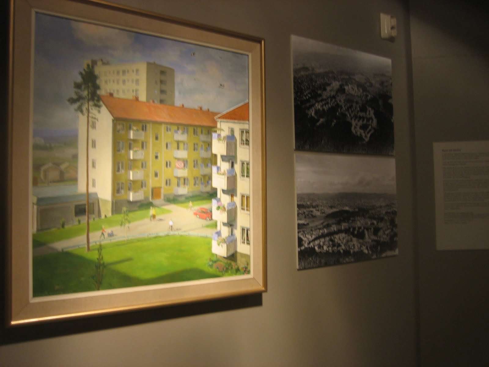
So, let's try to use these terms on our example, the painting. The original painting is a qualified medium, a painting, realized through the technical medium paint on a canvas, built up by the basic medium still image. This is not so interesting on its own, but what happens when the painting is turned into a digital copy, enlarged and printed on a wall? Now the qualified medium is not so easy to name, but maybe it is mostly understood as a wallpaper. This wallpaper is realized through the technical medium print on wallpaper. The qualified medium wallpaper represent the technical medium paint on canvas which mediates the qualified medium painting. Elleström explains that technical media mediates basic and qualified media, while basic and qualified media can represent anything, including technical media or other qualified media. The qualified medium painting represent a suburban exterior, while the qualified medium wallpaper represent both the qualified medium painting and the suburban exterior.
To just use the terms do of course not reveal anything new about this example, but I think it is interesting to be able to describe precisely what role the qualified medium painting do have in the wallpaper version. Another interesting question is which aspects of the qualified medium painting and the technical medium paint on canvas is the technical medium print on wallpaper able to realize? And what does it mean for our experience of the wallpaper that we understand that what is represented is the qualified medium painting? How to use Elleström's model on exhibitions is something I will discuss in my thesis, so this is just the first steps to try how it can work. The terminological division between qualified, basic and technological media is only a small part of the model and I will try to use other parts of it in other posts.

mandag 14. februar 2011

Media genres in the exhibition

In the end of January, during my small tour in Norway, I visited the Museum of Oslo. The Museum of Oslo consists of three museums, Oslo City Museum, Oslo Theatre Museum and Intercultural Museum. At the City Museum I saw an interesting example of the role media genres play in exhibition design and how different media genres do affect how we understand a content. The example is a picture of a suburb exterior from Oslo, which is to be found in two different versions at the City Museum. The first one is the original painting by Arne Stenseng with the title Lambertseter 1957. This painting is hanging in the first room of the main exhibition which deals with the history of Oslo. This first room gives you a summary of the history of Oslo, and the painting is there to represent the building of new, and better, housing for workers outside Oslo, close to the nature. The other version of this picture is to be found in the temporary exhibition about the suburbs, or satellite cities, around the central parts of Oslo.
As a part of this exhibition there are three small rooms decorated as suburb apartments from respectively the 1950s, the 1970s and one from around year 2000. The second version of the picture is used as an element in the 50s apartment. When you enter the 50s apartment you have a living room interior in front of you on the left side of the room. You see a couch, a table, a chair, a shelf with knick-knacks and some pictures on the wall, all typical for the 50s. On the right side of the room, the illusion of a real apartment is interrupted by a wall with four showcases. Under the showcases there is white text written on the grey wall. On the left side of the wall you find the second version of Stenseng's painting. The painting is copied and blowed up so it covers the whole wall from top to bottom.

Why is this example interesting?
When I first saw the enlarged poster version of the picture, I didn't know it was originally a painting, i.e., a work of art. The picture caught my attention because the rest of the exhibition relies heavily on enlarged black and white photographs. This means both the picture's colors and the fact that it is painted, made it contrasts with the rest of the exhibitions illustrative elements. My first questions were therefore related to how drawings or paintings work differently in an exhibition than photographs. When photographs are used in an cultural history exhibition, it is with an unsaid promise that the photograph is showing how something was. It is giving you a peek into the past, and, to some extent, an objective peek. The objective character of the photograph is a debated subject and I will not go into that here, but I believe that for the general visitor, a photograph is mostly understood as direct impression of reality. Paintings' and drawings' relation to reality are different, because they are, in a stronger sense than photography, made by someone. We more easily doubt a painting's trueness than a photograph's. Therefore I wondered, what kind of role had the picture of the suburb exterior, why not use a photograph? Was it just a decorative element in the 50s apartment? When I then afterwards noticed the original painting in the main exhibitions first room, I became even more interested. Do the visitors' understanding of the picture change when the picture's medium changes? And how do we understand works of art in a cultural history museum?

Some thoughts from the curator
I was so lucky that I got the opportunity to talk with Linken Apall-Olsen, the head of Department for Exhibitions and Public Services at the City Museum, about these questions. She tells me that the version of the painting in the suburb exhibition make conversations among the visitors. Maybe, she wonders, it is because people look for a message in the picture. It is different from the photographs because it is carefully thought through by the artist, and not just a snap-shot like a lot of the photographs. The colors also gives it an own aesthetics, which is not only different from black and white photographs, but also from color photographs. Linken says she uses the picture a lot in her guided tours of the exhibition. The painting communicates some of the 50s optimism, and she points to the swallows flying high above the buildings, which refers to the proverb that says if the swallows fly high it will be nice weather. This makes the picture more than an aesthetic element, it also provides information strongly connected to the exhibitions message about how suburbs were understood and why they were build in the 50s. I ask if she talks differently about the original painting and the copy when guiding visitors. She answer that she usually mentions the painter's name, when talking about the original painting, something she almost never do in the suburb exhibition. Here it is the different stories in the picture, like the swallows, that is important. These small stories are, literal, enlarged in the copy, and therefore get more attention.

Nest step: theory
I will follow up on media genres in exhibitions and this specific example in my next blog post. There I will introduce a media model developed by Lars Elleström, which I mean can be useful for theorizing media use in exhibitions. The purpose of Elleström's model is to improve our understanding of the differences and the similarities between different media. I find this model very interesting for the understanding of the intermedial aspect of museums exhibitions, and it gives some terminological tools that might help us describe different media in the exhibition more precisely.

torsdag 3. februar 2011

Interaction - with what?

Interaction is a key-word in exhibition planning today. But what do we want the museum visitors to interact with? The museum personnel, the information communicated by the exhibition, the technology or the other visitors?


One week ago I visited the new national centre of pop and rock in Trondheim, Norway, called Rockheim. Here you can, among other activities, visit an exhibition about Norwegian pop and rock from the 50s till today. The exhibition depends heavily on technology and the visitors interact with different kinds of screens in different kinds of ways, to get to know the history of norwegian pop and rock, which is told mainly by music videos, photos and newspaper articles. The exhibition opens up a lot of interesting topics, and I will probably write more about it in oncoming posts, but now I will use my experience of the exhibition to describe the above mentioned kinds of interaction.


Interaction with the museum personnel

At Rockheim they have made a quite brave choice by not adding any explanatory text to the media installations. This can be experienced as something negative, because you feel quite stupid when you don't understand what to do. But, this has led to a lot of interaction between the museums personnel, walking around with their blue t-shirts, and the visitors, because most visitors have to be explained how the different installations work, something I find very positive. I think it really does something with the ambience in the museum. What is more scary than the silent museum guard sitting on his chair in the corner, just watching? The last year I have been working at the Karen Blixen Museum outside Copenhagen. Here the museum guards let the visitors in to Karen Blixen's private rooms every half hour, and give a short introduction to the museum before the visitors can walk around on their own. This means that I say hello to each and every guest, and, because the doors have to be locked all time, I say goodbye when unlock the door and let the visitors out. I think this contact between the museum personnel and the visitors does something for the visitors experience of the museum. Both at the Karen Blixen Museum and at Rockheim this contact happens because of an inconvenience, a locked door and unclear technology, but the result, the interaction between museum personnel and visitor, I see as an advantage.


Interaction with the technology

It is fun to visit Rockheim, it is like getting a taste of how we in the future will be interacting with technology. You move in front of a screen, and the picture breaks like glass in small pieces and a music video starts. Or you point with a laser pen on a circle on a map and the picture on a TV-screen changes, when you point at another circle, another town on the map, another TV-screen reacts. Some of the installations at Rockheim gave me the feeling of only interacting with the technology, with this I mean that I only tried it to see what happened, not because I wanted to read more or wanted to see a new music video. The way the technology worked was the main entertainment. If you are interacting with the technology or the information depends of course on what your interests are, but it must be the goal of the curator to make people be interested in the information. I guess in most cases the interaction is included to make people get more information, not to make them learn about new technologies, except where the exhibition is about technology.


Interaction with the other visitors

Museums are often thought of as public meeting places, and maybe there is a wish from the museum that the visitors interact with each other. At Rockheim there are possibilities for interaction between the visitors, but I think it works best with the ones you know. There are lots of places where there is room for more than one participant at the time, but nowhere do you need to be more than one to handle the installation. This means you only interact with other visitors if you want to, and therefore probably just with the one you are coming with. Then, it must be said that I was there on a quiet day, so this may change if there is really crowded and and you can't have an installation to your self. Also because the installations are difficult to understand you might start a conversation with some of the other visitors to find out what to do. Again, I think that people talking together in the museum is a good thing for the ambience, but it is not often you see exhibitions where interaction between the visitors is an important aspect.


Interaction with the information

This might be the most common goal when curators includes an interactive element in an exhibition. Every museum want the visitors to actively engage with the information the exhibition present. Interaction with information can happen on different levels. For example it could be that the visitors contribute to the information, by writing messages to the museum or the other visitors. Another example can be when the visitor actively think something about what is communicated and act on this by choosing one specific topic to learn more about or when the visitor has to do something to get more information, and is focused on the information and not on the technology. Even though I some times felt I just interacted with the technology at Rockheim, I mostly felt I interacted with the information. One particular successful installation is a band bus, a room decorated like the interior of a band bus, with screens in front and on the sides acting like windows where you can watch the scenery the bus is "driving" through. Here you can sit in a good chair and read an electronic magazine. By touching the pictures in the magazine a music video starts in the "window" next to your seat, and you listen to the music through a headset. Even though the technology is very good, the content is more interesting. And most important, you get the impression that the technology is chosen to suit the content, not the other way around.